Design

An Architect's Master Bath Design

Here in San Francisco space is at a premium, so making the most of the square footage in your home is essential. Many homes have that hard to use, slanted ceiling closet that is just not where you want to start every morning when it's time to get dressed. Gregg, our Principal Architect, had just that space. He's been envisioning transforming this small closet into his dream master bath. His project finally made the job list.


First things first, in order to square off the ceiling for more usable space, the ceiling/roof had to be punched through, creating a dormer. Once approved, demo began and it was time to design the look and feel of the space.


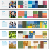
The ocean and the beach have always resonated with Gregg so when a friend gave him these photos, he knew they would be his design inspiration. With a beautiful, timeless, yet masculine color palette, the search for finishes began.

A matte glass mosaic tile from Artistic Tile - The Tozen Collection in Silk Oxygen with gorgeous blues and browns was selected to cover a full wall in the shower. This is the first thing you see upon entering. To make the small space feel larger, a large format tile from Country Floors - Ecocem Porcelain Collection in Melted Ice with a honed finish was used for the other shower walls and the floor. A watery blue grey paint, sophisticated enough for a master bath finished the other walls. Dunn Edwards - Color: Lake Placid.


A floating vanity with a white counter top and a dark wood base also help to make a small space feel larger and airy. Bringing in a wood element adds warmth to a bathroom full of hard surfaces and can also connect an updated space to the roots of a traditional home. Vanity finishes include Caesarstone solid surface in Torquay and Aspen Oak Wood laminate from E.B. Bradley. Designed in-house and built by Kenwood Cabinetry in San Francisco.  We cannot say enough wonderful things about Ken Fong and his work. Thank you!

Another key design element in any space is lighting. Gregg did not skimp here. The vanity lighting is flush and inlaid for an ultra clean look. Under cabinet lighting for the vanity provides a soothing ambience at night. Overall recessed lighting in the space and shower is dimmable and all are on their own switches for efficiency.


With every bathroom design we create at DM+A, the toilet, as nice as it may be, must not be the focal point. With this small space we tucked it behind the vanity.


Not only does Gregg love his new bath, his feline love, Jakers, can often be found lounging on the luxurious radiant heat floors. Cheers to a job well done and long overdue!


Modern design just isn’t what it used to be.

Contemporary DesignOne word many people use to describe the overall feel of their ideal design is “modern,” especially when the design is meant to update an older space. What they typically mean is they want the style and characteristics of their new space to be current and recent. They want something contemporary. “Modern” is a funny word when used as an identifier of style. Historically speaking, modern describes the span of time around the years 1500 to 1800. But kitchen and bathroom fixtures from that time period haven’t yet come back into vogue, and their electrical and lighting designs really wouldn’t meet current building codes.

In the design world, modern describes a specific style movement that was considered “contemporary” from the 1920s through the 1950s. Carefully selected elements from the modern era, as well as those from various other design periods, are often brought together cohesively by present-day designers.

By those same design world definitions, contemporary describes the time period between the 1980s and now, whenever “now” happens to be. If represented on a timeline, it’s typically preferred that contemporary design sits a little closer to the now side than the one bookended by Reagan’s move into the White House. Technically speaking, unless there is a mass shift by the design community at large to either go back in time or far ahead into our estimated future, contemporary design, by its very definition, will be “modern” as long as there is a now for which it to refer.

It’s all complicated stuff.

Luckily, the DM+A team keeps itself up to date on current and emerging trends in architecture and design. We study and research current popular designs, and we know what’s needed in order for those designs to meet strict building codes. We’re watching the trendsetters, but our work is accessible enough to set trends of our own. We know hip and with it and chic and sophisticated and cool. In short, DM+A knows contemporary.

But we also know modern.

“What are these? Houses for ants?”

IMG_0797IMG_0731Yes, actually, if not eaten soon, those tiny buildings may indeed house ants. Today, however, they’re occupied by marshmallow snowmen, gummy bears and various other sticky sweets with which the youngsters chose to adorn their creations during this year’s annual Gingerbread House Decorating Party at
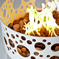
 Edgewood Center for Children & Families. All year long, we’re the creators. Guided by our clients’ specific needs and desires, we help transform their projects into beautiful and unique commercial or residential spaces. We’re great at what we do and we’re thankful so many people continually place their trust in our architecture and design services. But once a year, we look forward to throwing the building codes out the window and handing complete creative control over to the children of Edgewood.

We supply the basic gingerbread structures, the candy-coated chocolate building blocks and the adhesive sugar icing. The children supply the design skills and all the labor.

Wasting no time with meticulous measuring, and with very little regard for structural integrity, the children got to work this year renovating their plain gingerbread houses into edible works of art. We got to enjoy the creative process as spectators, our roles relegated to little more than replenishing the supplies of candy canes and gumdrops that were used as wall beams and multicolored roof tiles.

Though we had no expectations until that final peppermint candy was iced into place, this party is an old tradition for us, and one that everyone involved looks forward to every holiday season.

More than twenty years ago, the first Gingerbread House Decorating Party took place at Edgewood, a center here in San Francisco that serves children and families who have experienced traumatic stress leading to learning disabilities, mental illness and debilitating behavioral issues. Since 2008, our own Gregg De Meza has spearheaded the annual party, aided by a crew of helpers made up of DM+A’s staff, family and friends.

This party is more than just an afternoon of smiles, laughter and the inevitable sugar high. It’s about appreciation for opportunities — the opportunities Edgewood helps to afford to their children and families, and the opportunity we’ve been afforded to do what we love every day here at DM+A.

And, already, we’re looking forward to the opportunity to do it all again next year.

Time to BBBe Nice

grey in gray chair greyteknion babyblueslogo Just wanted to give a shout out to Teknion and B&B Italia for the hospitality at the recent Bourbon and BBQ event at their San Francisco Showroom.

A big YUM for the mac 'n cheese and BBQ from Baby Blues. My little guy, Grey, had all smiles for the server too. As soon as he can eat, I will definitely be bringing him to Baby Blues!

The showroom revamp is very cool. Sweeping city views and the seating options were so irresistible we had to photograph the Baby in every piece.  My personal favorite is Teknion's Fractal chair upholstered in Magnify (Gray) - such a beautiful piece and the sheen and texture of the fabric is gorgeous.

Thanks again Teknion for sharing!

HGTV + Showcase House = Good Times

jonathan rachman entry HGTV Party at 2014 San Francisco Decorator Showcase House

We've been having so much fun at all of the industry events this year and recently attended the HGTV party at the 2014 San Francisco Decorator Showcase. The annual Decorator Showcase benefits San Francisco University High School's Financial Aid program. The Pacific Heights mansion showcased work from the Bay Area's top interior and landscaping design firms.

This year we noticed the overall trend was the use of gold starting at the entry/foyer, designed by Jonathan Rachman. Loved, loved, loved the cowhide rug with the gold splatter in true Jackson Pollack style. We moved on to the dining room where I had to take a closer at the matte gold flatware (so cool), yep, my curiosity caught the attention of everyone in the room including the designer, George Brazil of Sagrera-Brazil Design because, of course, the flatware was attached to the table!

Moving on, I have to give a shout out to HGTV and Hannah Shipley. You are the hosts with the most! As you all know, we DM+Aers are indulgent when it comes to food + drink. Our glasses were never empty and the blue cheese cheesecake bites were so heavenly. I must have the recipe, so if anyone has it, please post! Onward to the next event.

7 for 7

Architect Registration Examarepact For those of you who follow our blog, you might have seen my post explaining the process of licensure for an architect.  Or the one where I passed Site Planning and Design.  Well those were about 3 years ago and there is a 5 year limit on the exams. So if I didn't pass all of the exams by the 5 year mark, I would have to retake any that were over 5 years old.  If any of you know me, you know that that is not an option for me.  Ideally I would have picked one exam off after another.  But with teaching on the side, rowing, and just wanting to have a life, meant the 5 year limit was approaching and I still had (6) exams to go!

Luckily I came across a program through the AIA San Francisco called the ARE Pact.  It is where you register for the program with a fee of $1,000.  With the enrollment, you are placed within a study group of 10 and you gain access to free ARE lectures and study materials.  If you take all the exams within 1 year you are refunded your $1,000.  I know myself enough that if I was able to round up $1,000 to partake in this program, I would make sure I would get that thousand bucks back!

Well that is what I have been doing this last year.  I didn’t row, cut back on my teaching, and barely had a life!  But with perseverance and determination I did complete all the exams and am happy to report that I passed all of them as well.  I went 7 for 7 and am officially done with the ARE (Architectural Registration Exams)!  Thank you ARE Pact & Michelle Railsback for making this program happen!

But I can’t call myself an architect yet…I still have to take the CSE (California Supplemental Exam)…And the process continues : )

Product Love - Wardrobe for Windows

gecko install 3 gecko install
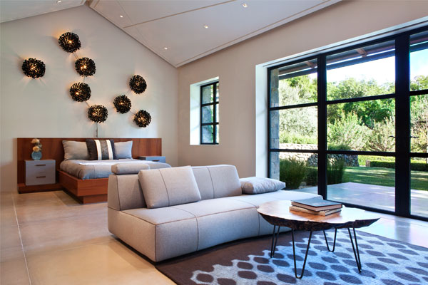
Flexibility, low commitment, variety and we’re not talking about the qualities of the ideal mate. We're praising Gecko from Studio by 3form. In a dense city like San Francisco where many rent, walls are shared and window views can mean no privacy, Gecko from Studio by 3form is a cool design solution. This is an adhesive backed textile system; an alternative to traditional window coverings; a window film that can be reused, won’t leave a residue when removed and can then be reapplied over and over again. All that’s needed is soapy water and a squeegee as demonstrated in the Gecko Installation video. I like to think of Gecko as a sort of wardrobe for windows.

Gecko is offered in a 54" wide roll for all patterns. Standard roll length is 25 ft. Custom lengths longer than 25' are also possible.

For more information and to view the many patterns available, click here.

Healing Hues

Lurie Children's Hospital color paletteI recently read an inspiring article about Chicago's new Ann & Robert H. Lurie Children's Hospital of Chicago in Sherwin Williams Stir Special Issue 2013. The article reminds the designer in you how important your design choices have on those using the space. ZGF Architects designed with color to distract from the fact that the space was a hospital for children and they did so with much success.

In determining the color palette, the design team took cues from the hospital's Kid's Advisory Board - a committee of children ages 12-18 years of age; most were born with chronic conditions so they are familiar with hospital settings. Interestingly one of the main points from the kids was to keep the pastels to a minimum. They were interested in saturated and vibrant colors, so hurray!

The end result was a 20-hue color list divided into five palettes as pictured. For more details on this amazing project check out ZGF Architects Projects.


Product Love

1000 Containers,1 sheet of 100 percent3forms 100 percentWe love 3form's 100 percent - an architectural resin panel. Each panel contains more than 1,000 bottles; an excellent way projects can earn up to 2 LEED credits for recycled content, how cool is that? We can't wait to use it on our next project. The panels are available in 2 pattern directions: latitude or longitude. What's your preference?

Check out their site for more details: http://www.3-form.com/materials/100_percent/


Boarding School

Many a sales rep has crossed the DM+A threshold, but it’s something special when their products get past our “seen it before” sensors.  Yesterday Jeff Sterneberg wowed us with Domusarte I.P.F. wood flooring.  I love it when a product sparks my design-y brain into action and this line had me coming up with design solutions a plenty.  Jeff did a great job of educating us about his product line and showing us some incredible installations done throughout the world. 

What makes this flooring so desirable, besides being from Italy (of, course), is the range of finish options, board sizes and customization possibilities Domusarte offers.   It’s a beautiful, durable and flexible flooring that is perfect for distinctive interiors. 

If you haven’t already seen this line, you can contact Jeff at 415.754.9649 or jsterneberg@gmail.com.

Let’s Get Fulk’d Up!

The DM+A team came out in full force to check out Ken Fulk’s Peep ShowKen Fulk created much more than a party for his guests.  Upon entering the party, guests were transported into a provocative, sexy, Vaudevillian world of carnival and mystery.  At the entrance, guests were greeted by two scantily clad dancers, dancing in giant skeleton key peep holes in the front windows.  Party goers could witness things such as stilt walkers, women dancing with snakes, contortionists and actors in costumes getting it on in the middle of the party. 

Ken’s new collection included an unlimited amount of vintage and found objects that are sure to make a statement in any interior.  A favorite of the DM+A crew was a large chandelier made of rusty saw blades. 

Ken Fulk’s Peep Show was an amazing party that demonstrated the creativity and imagination of Mr. Fulk’s design team.  Some are already referring to the evening as the party of the year!

Eduardo’s California License Celebration

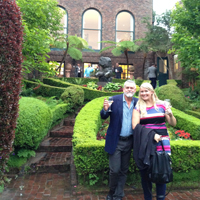
Since I finally got my architectural license in this state, Gregg invited the team to celebrate the event. I decided for Local Restaurant & Wine Bar and we all went for lunch on July 27th; I think it was the right decision and will tell you why. It’s very clear to me this team enjoys two things: good crispy Italian pizza and better yet, good wine (not necessarily in that order though). This place has both and the service is excellent, with great help from the owner choosing the right wine and getting your glass refilled.

Saying that’s the best pizza ever would be excessive, but if you’re a pizza lover, this is a place you cannot miss. We ordered four different pizzas (after some serious appetizers) and we all thought that three of them were out of this world:  Salsiccia (with house-made fennel sausage, fresh mozzarella, scallions, and Calabrian chillies) ,then Linguica (with linguica sausage, caramelized onions, red bell peppers and cheddar) and finally Local Pizza (with mozzarella, goat cheese, pepperoni, bacon and house-made sausage).

Besides great food and wine, the place has an interesting modern and clean design that’s worth seeing; nice atmosphere and easy street parking. I don’t think I will get another license soon, but I’m looking forward to going to Local again.

Future Designers of America

AICA-SF LogoI was recently invited to be a member of the Professional Advisory Committee for the Interior Design Program at The Art Institute of California – San Francisco.  Always ready and willing to offer my two cents on anything design-related, I happily agreed.  This involved participating in a Student Portfolio Review and a discussion about the program’s curriculum.  My fellow committee members included other industry professionals from firms such as BAR Architects, HOK and the Wiseman Group.  It was great to hear what different studios are looking for in junior staff and to observe what other design pros see when looking at the students’ work.  The general consensus was: show more process and basic design practices and focus less on the smoke and mirrors in the presentation.  So, okay kids, listen up.  Here’s a little free advice: Hone your design skills; develop proficiency in drafting conventions; practice your hand sketching; and have a point of view!  If you can’t demonstrate these things, all the overblown graphics in your presentation documents won’t make a bit of difference.  As the incredibly astute Louis Schump of HOK offered, “It’s hard to see what’s going on with the plan when it’s cloaked in a sea of baby’s faces or a bamboo forest”.  So true, Louis.  So true.